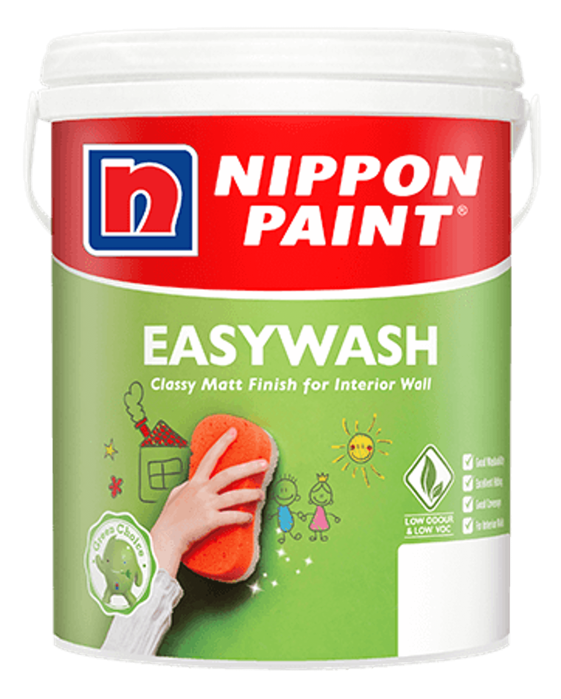
Showcasing the glory of colour in all its splendour is Nippon Paint with its new Trend Beyond Colours 2022/2023 collection, devised for a total transformation of the self.
DID YOU KNOW that colour is a powerful form of nonverbal communication? Considering the field of colour psychology is essentially about the study of how colours affect perceptions and behaviours, it is fair to say that colours are more than capable of dramatically altering the atmosphere of a home. In turn, this creates an immediate ripple-effect on the moods, thoughts and energy levels of its occupants. From awakening the senses with jubilant yellows to calming those pesky tensions with soothing greys, the right hue can certainly create the right impact.
Backed by a successful track record, multiple award-winning Nippon Paint (M) Sdn. Bhd has long associated its illustrious name with creativity, quality and innovation as the leading paint brand in the country and across the continent. It has also attained multiple prestigious awards from the Reader’s Digest Trusted Brand Awards and Putra Brand Awards, along with several Green Excellence Awards by Frost & Sullivan in its concerted efforts to champion sustainability towards a greener footprint.
Introducing a total reset of the mind, body, spirit and soul is the label’s brand new Trend Beyond Colours 2022/2023 collection, divided into four subcategories to cater to different feelings, moods, personalities and preferences that encourage a holistic, positive transformation. After the past couple of tumultuous years, there is undoubtedly no better time than the present to play around with colours that evoke a renewed sense of optimism and promise a fresh start.
Without further ado, here is the complete breakdown of this all-around pleasing collection:
REVIVE
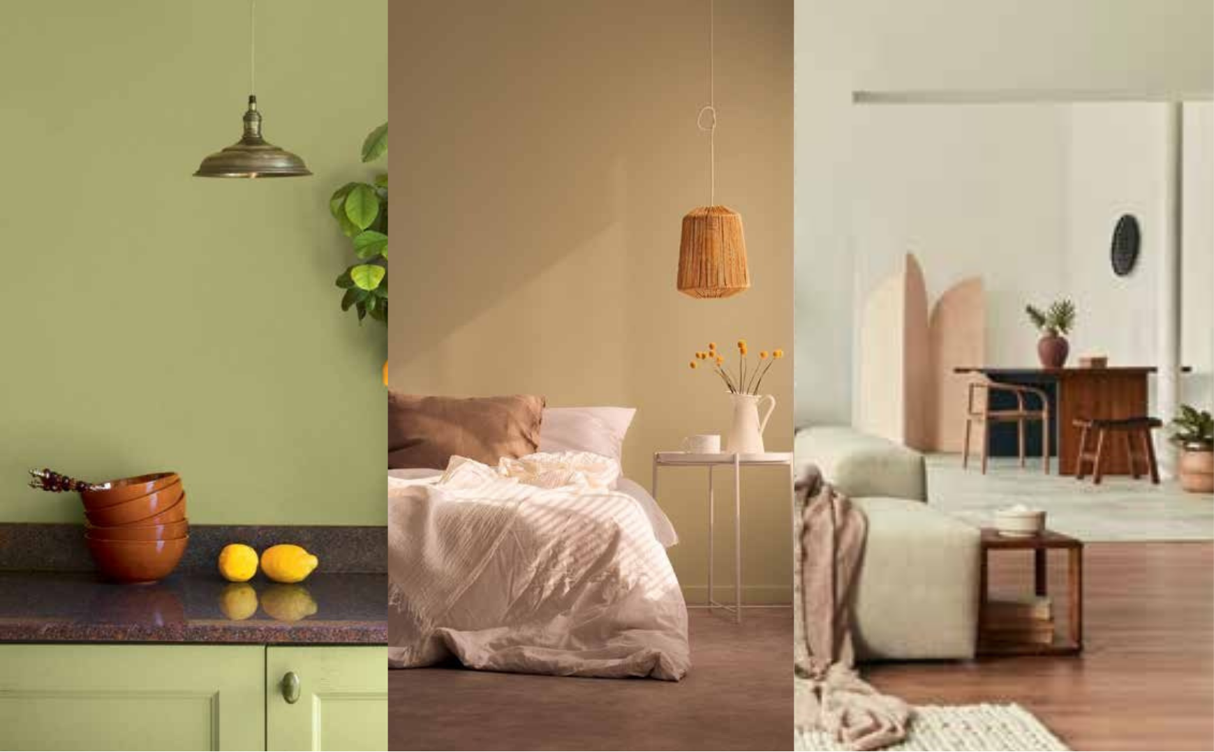
Nothing reinvigorates the senses quite like the presence of Mother Nature herself, or at least the colour schemes she associates herself with – think raw elements such as the sun, soil and leaves. As such, Revive seeks to invite the healing powers of nature indoors, through the familial tones of the natural landscape, for the noble purpose of health improvement and spiritual restoration; in fact, these benefits stand as the inspiration behind this palette.
WAYS TO ACHIEVE IT:
-
• Instead of potted plants, spring for hues reminiscent of lush greenery for that healing factor.
-
• Usher in the bright rays of the sun with mellow yellows for a cheerful touch.
-
• Get warm and cosy with hints of contrasting earthy browns.
RESTORE
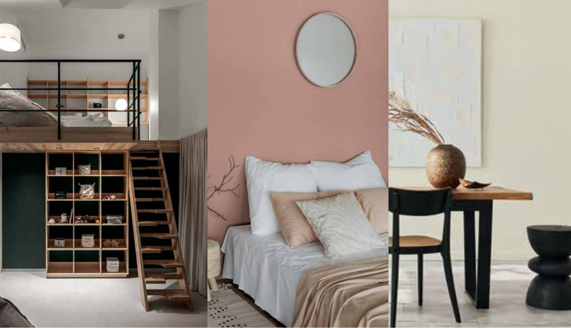
In this day and age, mental health has justly become the leading topic of conversation. With the hectic, noisy and overstimulating state of modern living, many have begun placing it at the top of their priority list. Bringing us a step closer to achieving a healthier frame of mind is Restore, composing recuperative spaces with gentle, nature-inspired tones as well as soothing textures for optimum levels of tranquility.
WAYS TO ACHIEVE IT:
-
• Sweeten the senses with muted pinks for a delicately fresh but soothing ambiance.
-
• Take a breather from the demanding 9 to 5 with light greys and whites that add layers of depth.
-
• Urbanise your retreat with a cloak of dark greys for an unconventional take on serenity.
RECONNECT
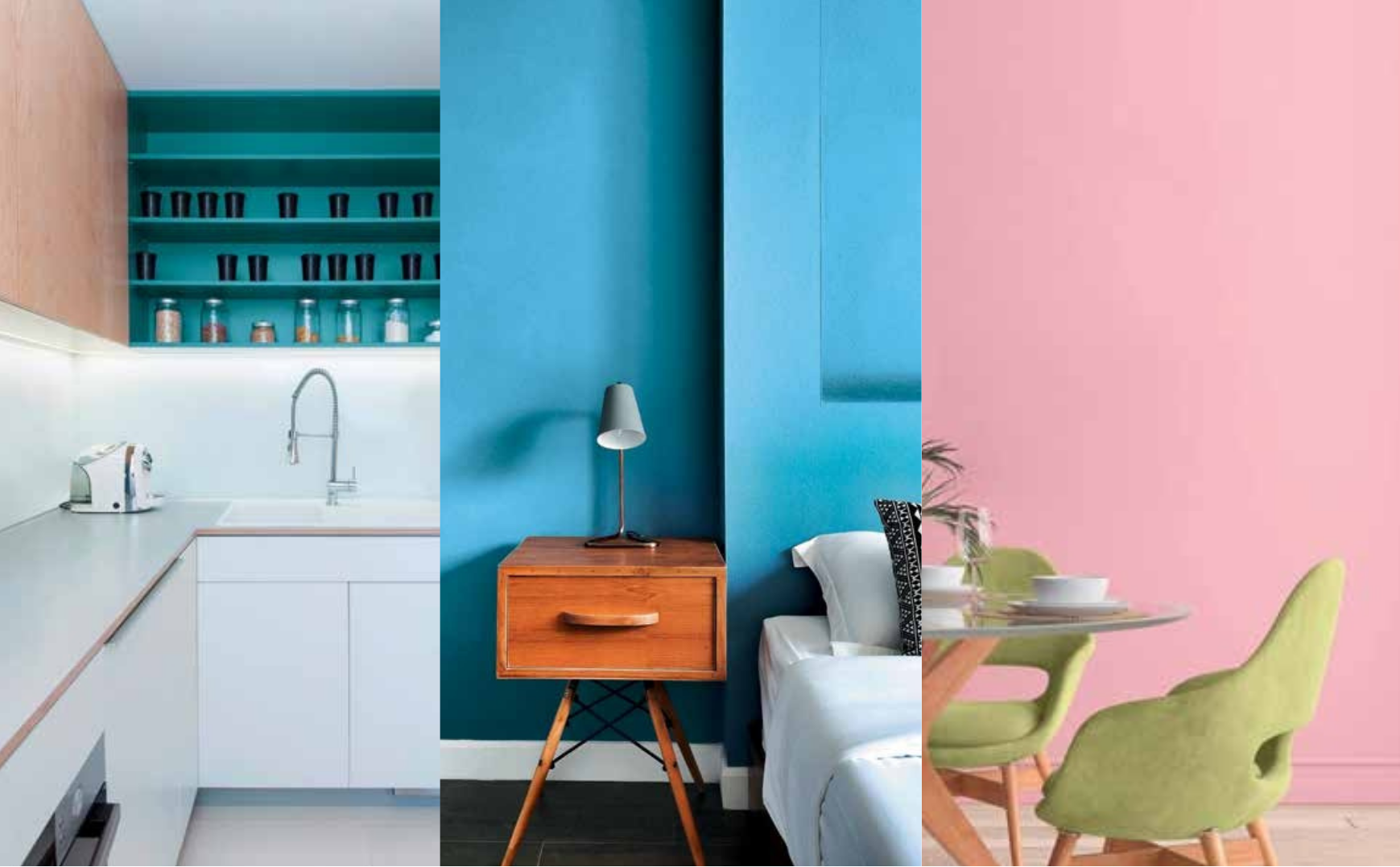
Now more than ever, interacting with others is a highly coveted necessity required to nourish the soul. With that in mind, Reconnect aims to inspire joyful, harmonious and hospitable social environments through colour. More specifically, the balanced use of welcoming natural hues, cheerful mid-tones and energising accent colours have come into play in the spirit of togetherness.
WAYS TO ACHIEVE IT:
-
• Symbolising harmony, play around with diverse shades of invigorating greens.
-
• Invite whimsy, merriment and youthfulness with trendy pastels.
-
• Make a bold splash with strong primary accent colours.
REFLECT
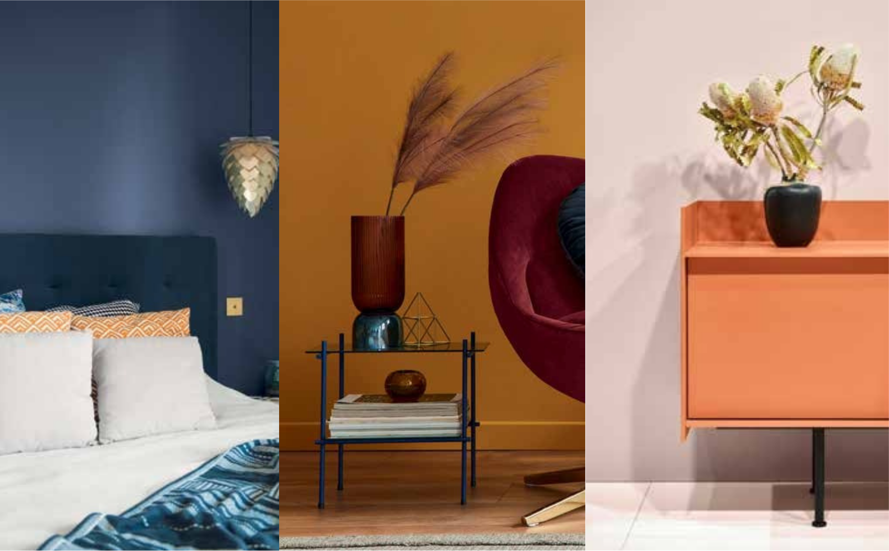
With a competitive hustle culture that consistently demands dreaming big and looking forward, it is pertinent to allow ourselves to remember and appreciate the little things that bring us joy. Soaking inspiration from nature’s cherished gifts to the reassurance of everyday rituals, REFLECT offers the opportunity to introduce a touch of mindful indulgence through a balance of rich hues, soft mid-tones and ethereal pale hues.
WAYS TO ACHIEVE IT:
-
• Luxuriate the senses with bold, punchy tones that make a statement.
-
• Embrace the glowing light with a sophisticated, feminine touch of greyish pinks.
-
• From deep seas to open skies, cool off with bursts of true blue.
Contact Nippon Paint Malaysia for Your Needs Today.
Customer Careline: 1-800-88-2663
E-mail: customercare@nipponpaint.com.my


